Week 17 – FMP
This week brought big changes the science treehouse.
I started off by modelling a few props for the inside of the observatory as you can see inside it and It felt neglected. I just made some low poly simple assets because you cannot get up close to them and they are largely blocked by the telescope. However I think the add to the scene and are easily readable and effective in making it more of a scene than an empty shell of an object.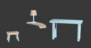
The largest change I made to the scene was to extend the ground. By doing so it balanced out the height of the tree a lot more and creates a better composition. I think this was a good idea (suggested by Heather) as it creates a much better flow for the eye and stops the tree from looking too out of place.
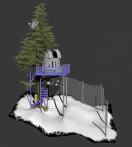
The last change was to add in a fence around the back. This was also to help with the flow of the eye and to create a bit more of a foreground, middle ground and background. It was simply made but really added to the scenes composition. If I were to go back to it I would create some breaks in the fence and more wear to it to make it look more placed within the scene and used.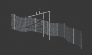
For the girly treehouse I realised that I needed something to break up the water and the stones so I made some high poly reeds and baked them to a plane and textured them and then added a simple wind to them. I think they look pretty realistic if not slightly too thick and rounded but they work in the scene to break that section up.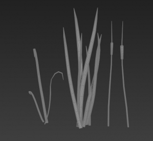
I also spent time making the wall texture in substance painter:
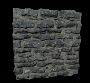
I am really proud of this rock texture and how quickly I was able to make it. I based it off this image: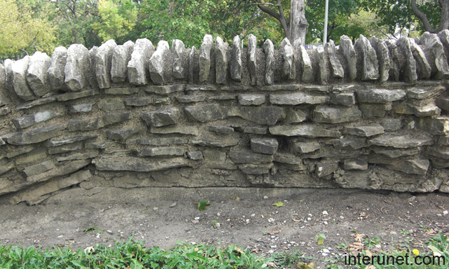
reference: Interunet (2018). stone fence. [image] Available at: http://interunet.com/old-stone-fence-picture [Accessed 10 May 2018].
I made my rocks more saturated than in the reference image though as my dioramas lighting can make things look washed out so I wanted to compensate for that.
I have encountered two problems with the wall however, one is that when I add a height map it makes the top section look jagged and wrong:
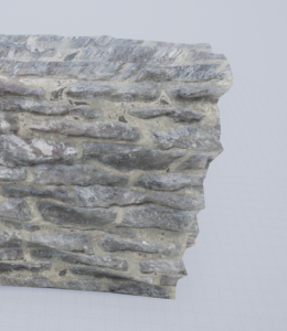
And whenever I model a top section like in the reference it looks too uniform and off so I need to find a way of combatting both those problems.
